The Blog


Recently we had the opportunity to help a new client called LADDER get out of the starting gate with a new logo and inspiration came from an unlikely or likely direction, depending how you look at it.
Creating a new logo for any client can challenging. Balancing what you believe is the best solution as a designer with what the client has in mind and taking into account the expectations of the sector can make what looks like a simple job on the surface, a more complicated job than you imagine.
The client already had a strong idea of what they wanted the core element of the new logo to be, which, in some cases, can be like the proverbial creative straight-jacket. Having something already set in stone stops you investigating options and directions that would perhaps deliver a better overall solution. In this case however, it was merely a case of taking the client’s initial idea and looking at it from a different perspective.
As the LADDER name suggests, a literal ladder was what the client wanted to feature heavily in the logo, but, as any designer will tell you, the dimensions of a good logo don’t really fit with the shape offered by a ladder. A good logo veers towards a square or chunky oblong.
The solution was to take the essence of the ladder and look at it in a way that would allow it to both please the client and still work as a logo. The solution was to take a viewfinder window crop of a ladder and set it neatly into a square and this, strangely was inspired by an old French paper snail.
When I started to think about what the crop of the ladder could be The Snail by Henri Matisse was the first thing that sprang to mind.
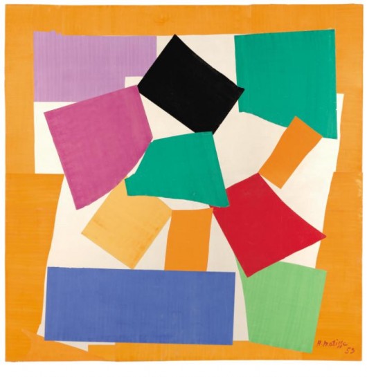
The Snail had all the ingredients I wanted to combine into the new LADDER logo. The right shape (nice and square – perfect for a logo), the use of color (bright and engaging and varied – perfect for the kind of educational sector the client will be working in) and the feeling of an abstraction from a recognisable form (the use of the colour blocks and the white space to form the ladder).
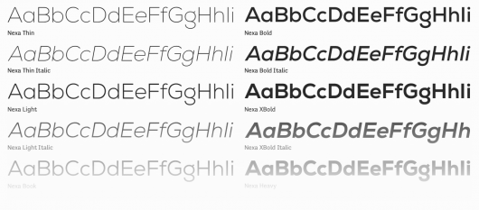
The final result is a logo that looks bright and fresh and engaging in its full colour form but because of the abstract cropping of the ladder form, maintains its interest and dynamism in its mono versions. To compliment the general razzmatazz of the mark we paired it with a very clean, modern sans serif called Nexa from Fontfabric. It’s a great alternative to the usual sans serif suspects and has a beautiful lower case g to boot.
![]()
![]()
