The Blog


It’s been a busy year in the studio and once again we’ve be working on everything from retail interiors for Sky in Ireland to designing food packaging for frozen Scallops. One of the recent smaller jobs we completed was the new identity for the Work Disclosure Initiative.
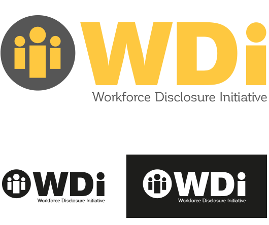
The new identity for the Work Disclosure Initiative (WDi) was designed to sit in a very corporate environment (a similar space to www.cdp.net) and the decision of taking the mark to use its initials rather than the full name was taken to help increase its legibility and impact. This paired with a high-impact and positive colour scheme and simple icon, allowed the final design to be strong even at small sizes.
The fonts we used to strike the right balance was a serious consideration. The WDi aspect had to be solid, strong and instill a real sense of purpose. This was always going to be a battle between some classic, solid sans serif font that included the wonderful Gibson, Gotham HTF and Berthold Akzidenz Grotesk BE Super fonts. In the end Berthold Akzidenz Grotesk BE Super won the fight. The subtle way the inside areas of the letterform handle the overall weight of the shape meant it hit the perfect balance of weight and strength without looking too blocky and leaden.
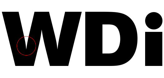
To counter the overtly heavyweight style of the WDi element and add some lightness and humanity to the logo we paired it with Latinotype Team’s beautiful Corporative font for the full name of the organisation. Corporative is a really great font. It’s a semi serif font that has a strong personality and very distinctive traits. It’s one of those fonts that looks great at any size and the closer you look at it the more there is to see. It also lives in a strange world between serif and sans serif without looking compromised or uncomfortable.

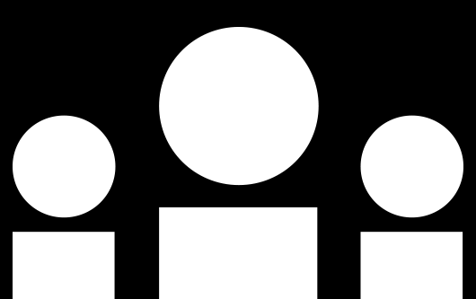
The theme of the design centres around people. These are the people that work in businesses, the people who make decisions in business and people who are effected by how businesses operate. This particular insight was the driver behind creating the 3i icon. The lover case ‘i’ from the WDi was used to reflect this and also in itself reaffirm that people are part of the whole.
It’s a simple sentiment, a simple idea that we think helped drive the final design in the right direction. The look and feel and narrative all slot together rather nicely.
![]()
The final design, whilst not being a huge job was none the less hugely satisfying and just one of those jobs we were happy to work on. The logo looks solid, fresh and positive and delivers on all the clients requirements and expectations. We’re looking forward to seeing it in the wild some time soon.
If you liked our new identity for the Work Disclosure Initiative and you’re looking for a new identity with a bit of personality then talk to us today.
Get in touch, we’d be happy to help.
![]()
