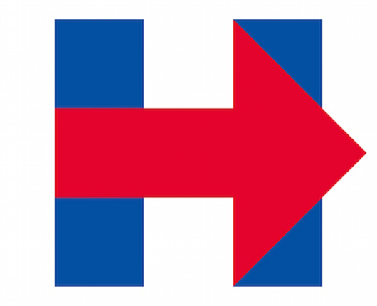
The new Hillary Clinton campaign logo is out and in what appears to be a complete u-turn in terms of style, quality, and aesthetic value from the much loved Obama campaign logo, this one is a sticker.
The 2016 Hillary Clinton campaign logo , which will be the most visible touchstone for her entire and historic campaign is a strangely odd, ugly and amateurish effort. And it’s not a ‘marmite’ logo where some think it’s great and others hate it. No, the new logo has uniformly been derided, lampooned and generally ripped to shreds by every right minded designer as well as just the normal man on the street that happens to have a pair of eyes.
Here’s a great article on Quartz. And here’s another good one on Vox.
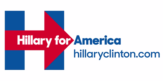
And here it is in situ. Slightly less eye-bendingly offensive.
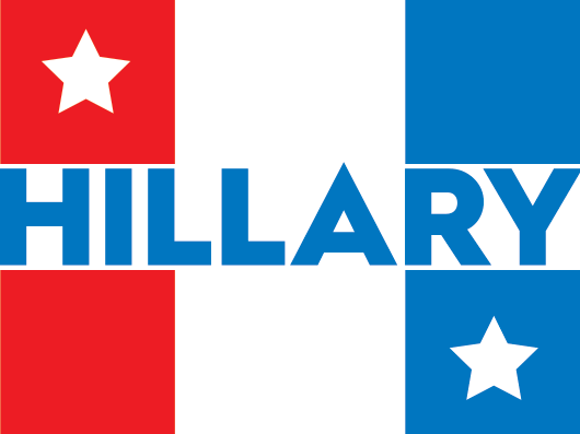
Like many, we wanted to see what we could in the 2 minutes it took her ‘designer’ to create their monstrosity. We set the clock. We gave ourselves 120 seconds to create our vision for the Hillary Clinton campaign logo – and this is what we created. In 2 minutes.
There’s a few basic themes, the Red White & Blue (moving left to right) which underpins much of the tub-thumping, patriotic ‘American Dream’. A couple of stars embedded in vertical stripes and it’s all pulled together into a big, brassy, bold capital H, using the name HILLARY to form the cross member between the two uprights.
It’s not great. It’s proabaly a little bit too Dukes of Hazzard. It’s a bit sloppy but we think it’s shows what can be achieved in 2 minutes and that it’s a damn sight more interesting than the new 2016 official Hillary Clinton campaign logo.
At Studio ROKIT, as a rule of thumb, if we can imagine wearing a t-shirt with it on the front it meets one of the criteria for it being cool.


Awful. You don’t know what you’re doing. You used her name as a fucking crossbar for the H? That’s Design blasphemy. There’s no sense of hierarchy and it’s a muddled mess of kitschiness.
The original logo is good, you’re too dim witted to realize it because you’ve been oversaturated in crap design for too long.
“That’s Design blasphemy” not sure if that even exists but thanks for the insightful and reasoned appraisal of a logo that I did for a laugh in 2 minutes in a response to the original design.
Personally the logo we created passes the ‘t-shirt test’ unlike the real Hillary logo. It also looks a lot less like a healthcare provider or insurance broker and more American, but hey, we did it for fun and set the clock for the project at 120 seconds.
I’d love to see your take on what can be achieved in that time for a bit of fun. Please, have a go and let’s see.
As for not knowing what we’re doing – 20 years as a designer says otherwise.