Design Fun


The new Microsoft Edge browser logo is here and it’s causing quite a stir. Like a lot of design output from Redmond’s favorite tech company, this new logo for a a browser previously known as project Spartan is splitting opinion and dividing the design community. Firstly, a tiny bit of history. Microsoft’s Internet explorer was […]
Read The Rest →

The new Hillary Clinton campaign logo is out and in what appears to be a complete u-turn in terms of style, quality, and aesthetic value from the much loved Obama campaign logo, this one is a sticker. The 2016 Hillary Clinton campaign logo , which will be the most visible touchstone for her entire and […]
Read The Rest →
Hot on the heels* of the first two Brands as nationalist parties posts, here’s the third and final run of big brands gone bad. Brands as nationalist parties – company logos re-imagined by Studio ROKIT. Once again, it’s a bit of fun to recontextualize logos and well loved brands and maybe take a few minutes […]
Read The Rest →
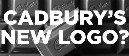
If there’s on thing we don’t like in Britain, it’s change to things we know and love, especially if it’s done without our knowledge. Nowhere is this more keenly seen than in the food and drinks that we love and have grown up with, but sometimes things need to change. Ordinarily new Cadbury logo would […]
Read The Rest →
If there’s one thing that the new YAHOO! logo proves, it’s that a good logo still matters. Of course the new YAHOO! logo and the way it has been launched has done wonders for YAHOO! globally by making them visible to a huge audience. For 30 days the released a single logo design that could […]
Read The Rest →
OK, so we’ve been really busy at StudioROKIT with client work literally coming out of our ears, but we’re still here and to prove it here’s a quick post of one of those .gifs (pronounced ‘jif’ – we’ll stick with gif thanks) that you can look at forever. It’s funny, but when Macromedia’s (and later […]
Read The Rest →
Brands, especially when you are dealing with fashion can be extremely cliquey and the higher up the fashion tree you go the more exclusive the brands become and the people who they want to wear them more selective. So we thought it was high time nerds got a high fashion brand all of their own, […]
Read The Rest →
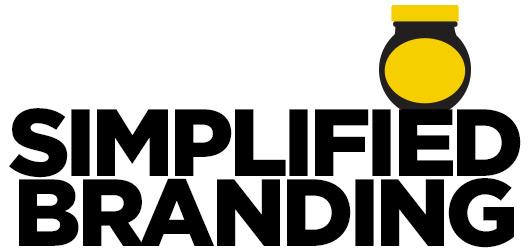
As consumers we’re bombarded with marketing messages on a daily basis. It’s a war out there folks, companies are in an endless arms race to try and create branding that both sticks in the mind and also drives emotional responses and it’s shape and colour that does a lot of the grunt work. Simplified branding, […]
Read The Rest →
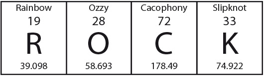
A little bit of fun… the Periodic Table – Periodic Table of Metal. Those about to rock, we salute you. Click this link or the image for a bigger, louder version.
Read The Rest →
If there’s one lesson any aspiring designer should learn and one that real designers know the value of it’s to be able to work quickly and be able to identify good ideas quickly. The 10 minute graphic design project – Treasure Island book cover is a little exercise in just that. Like most talents or […]
Read The Rest →