The Blog


Packaging is like crack for designers. We love it. We obsess over the minutest of its details, talk about it in the same way other people wax lyrically about an album, a film, a nice bottle of wine (nice label, lovely embossing) and we all have our favourites.
Why designers are so obsessed with packaging is a big question and probably has a lot of parts to the answer. But, I’m willing to bet that part of the reason is that packaging is kind of like a book or a pantomime, a performance piece. It’s a strange form of entertainment that speaks a little louder to a designer because as well as sitting there and looking at it like a consumer there’s also a subplot running in tandem where their imagination is deconstructing it, playing back the design process, imagining briefs, considering techniques, noticing subtle touches and references, spotting errors and being delighted by clever wit or bold audacity. There’s a lot for a designer to take away from packaging because generally, even with simple packaging, there’s a lot going on, more so with consumer products and especially with food and drink.
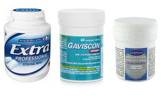
So, when bad packaging rears its ugly head we notice it. Mostly, bad packaging is really something that offends our own sense of the aesthetic. It might be the use of a colour scheme that we just cannot get our head around or a logo that falls short of what we would have produced ourselves or slapped on typography that looks like it was copied and pasted straight from Word®. All of these are bad things but they’re mostly forgivable and generally done by well meaning people trying to do the best they can for clients who want something a certain way. But sometimes bad packaging goes to a whole other level of badness. The badness that can only be reached by making the wrong choice even though you know it’s wrong, the badness that can only be called irresponsible. And Wrigley’s have done just that with the packaging for their EXTRA range of chewing gum.
As packaging goes it’s not pretty, it’s off-the-shelf plain plastic bottle does little to communicate anything about the product except one thing and it’s the one thing that slaps it down squarely in the centre of Irresponsibilityville – it looks like something it shouldn’t, it looks like something that is potentially harmful. It’s ‘design’ or to be brutally honest, its lack of design means this product looks a lot like many medicine products and that’s not a good thing.
So why does it look like this? Is it down to bad designers knocking out bad designs? Probably not. More likely, it’s down to product developers looking to get a product out onto the shelves into a plastic bottle they have sourced at a price that works. ‘Designed’ on a spreadsheet. The end result, cheap looking packaging that’s about as irresponsible as you can get.
Have you seen any packaging that’s more irresponsible that Wrigley’s latest? Let us know.
