The Blog


Keep Calm & Carry On – simplified – Just for a little bit of fun we set about reducing the Keep Calm and Carry On poster to merely an acronym.
Here’s our homage to a classic. Enjoy. Keep Calm and Carry On simplified by StudioROKIT.

Why you may ask? Well, why not. The full poster is so ubiquitous that the world is now full of clever (and not so clever) versions of the Keep Calm and Carry On poster, that if glanced at, you might mistake for the original until you read it. And it’s this primal recognition that we’re interested in. The shape and the colour and the tidal wave of it’s usage across the web and in shops and homes and in the media means it’s now recognised across the UK and further afield; it’s morphed beyond the message on the page and has transformed itself for all intents and purposed into a logo, shorthand for something bigger but ultimately recognisable in a blink of an eye. Pretty impressive for something that’s only been around for a few yeas (since 2000) and is part of a global corporation with a massive marketing budget. Viral is true power.
In fact, it’s history is just as interesting as it’s current fame. Here’s a quick potted history just so you can show off down the pub when you see a fake ‘rusticated’ tin one on the wall.
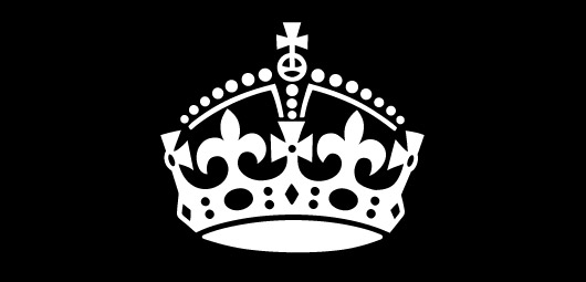
The Keep Calm and Carry On poster was the third in a series of World War 2 public information and morale posters drawn up by the UK’s Ministry of Information in order to boost the morale of the British people by broadcasting positive messages from the then reigning monarch, King George VI (he of the stutter and the star of The King’s Speech fame). The posters were what we would call ‘modern’ almost european in design with simple, gothic style white text on a pillar-box red background, the only non typographic element on the poster being a simplified and beautifully drawn symbol of royal crown of George VI at the top of the poster. Here’s a great in-depth history post on the subject.

The first two morale boosting posters, “Your Courage, Your Cheerfulness, Your Resolution will Bring Us Victory” (aprox 600,000 printed) and “Freedom is in Peril” (aprox 1,000,000 printed) were used extensively during the war period but the third poster with it’s “Keep Calm and Carry On” message, although printed, never saw any wartime action. Strangely the third poster was intended to be used ONLY if invasion was imminent, and we perhaps got closer to that than most of us care to remember sometimes.
At the end of WWII in 1945, nearly all of the Keep Calm and Carry On posters were collected and pulped. From an original wartime print run of over a 2.5 million it’s believed that on 2 original copies survive to this day. How’s that for a collector’s item?
The story of the Keep Calm and Carry On poster would have ended. A lovely poster lost in time, but luckily for us all Stuart and Mary Manley (owners of a bookshop called Barter Books in Northumberland) found one of the few surviving original copies whilst sorting through some old boxes of books. Being people of impeccable taste, they had the original poster framed and it sat near the till in their bookshop.
Now, there’s no doubt that the chap that designed this poster knew a thing of two about good design because nearly 60 years later it was still working its magic. The bookshop customers liked the Keep Calm and Carry On poster – a lot of them asked if they could buy it. And this is where the poster that time forgot, that nearly was lost finally exploded into the national consciousness. Stuart and Mary took the original, made printed copies and started selling it. And it sold and sold and sold.

An original Keep Calm and Carry On Poster
Since 2000 the poster has become world famous and highly recognised. It’s now doing the job it was intended to do all those years ago, get attention and deliver a message and it’s doing it rather nicely. It’s a great reminder that good design is timeless and choosing the right words can make all the difference between memorable and forgettable. There’s something poetic, simple and heartfelt (and maybe a little British) about Keep Calm and Carry On that just isn’t in the other two posters in the series (can you remember what they said from earlier in the post?) and this, in part is why it works so well. That and the fact we are suckers for out past as much as the tourists that visit Britain every year.
So now, years later this simple poster still looks good. The typeface used in the original, although lost in time (unfortunately) as it was most likely a had drawn face which undoubtably took cues from the great gothic fonts of the time, has its modern cuts and interpretations. The best of the bunch by a country mile is KeepCalm by Keith Bates. Keith is obviously a talented chap and the work he has put in to deliver an almost perfect interpretation of the entire family, based on just a few letter forms is what good design is all about – detail. The plain strong, simple red (somewhere around Pantone 186?) is as primal as you can get and it’s combined economy and power make it the classic that it is. Keep Calm and Carry On – a design classic that somehow is even better because it’s has no author, designer or name attached to it. It just is.

Howdy! Would you mind if I share your weblog with my twitter group? Theres lots of people that I think would truly enjoy your content material. Please let me know. Thanks kbedckacgbbabada
Share away!