The Blog


Here at StudioRokit.com we get to work on all sorts of cool projects and one of out favorite types of job is logo and branding work, a recent one was a request for us to create a new logo for LogiDeals.com and to accompany its launch a new advertising campaign.
LogiDeals.com is like a lot of digital companies in that they fill a gap in the market we never knew existed or disrupt an existing market. In LogiDeal.com’s case, they allow people to submit their requests for a courier to deliver whatever they need delivering, and instead of the courier service giving you a price, the job is put up for courier services to bid on. The result is that costs for the delivery of your parcel are reduced due to the couriers competing for the business.
LogiDeals.com initially had quite an extensive wish list of things they wanted the logo to convey (even before we got to their advertising) but, as we all know, this does not necessarily mean it will communicate well or more importantly even be memorable. In many cases the age old adage of ‘less is more’ is a defining principle for helping create a good logo.
In the case of the new LogiDeals.com logo we decided that one of the single most important aspects of the brand was it’s ability to communicate the movement of parcels and that those parcels could be any size. From a folder of important papers to a stuffed zebra.
We looked at a number of solutions in a wide variety of colour schemes but we finally arrived at a simple device in their existing business colours (to keep implementation costs to a minimum) that ticked all the boxes. Pun intended? Probably.
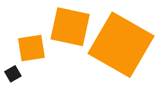
The simple nature of the tumbling blocks, which increase in size, quickly communicate a core message about what the brand is all about. And the colour scheme, whilst being a legacy of their old design, actually looks fresh and dynamic and much stronger than before.
We tied this mark into a rather nice wordmark for the rest of the logo, using a font that both encapsulated the blocky nature of the tumbling cubes but also captures the flowing nature of their movement. The font was an italicised bold version of the beautiful Hurme Geometric Sans.
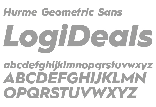
This cracking font was then used to create the wordmark for LogiDeals. We introduced the tumbling blocks over the top and swapped out the tittle (the little dot) over the lower case ‘i’ with the smallest of the blocks.
![]()
And to tie in with an idea we were already considering for the advertising we also created on for use on dark backgrounds.
![]()
As for the advertising we created for LogiDeals.com, we’ll leave that for another post.
If you liked our new logo Logideals.com and you’re looking for a new identity with a bit of personality then talk to us today. Get in touch, we’d be happy to help.
