Ocean Catch


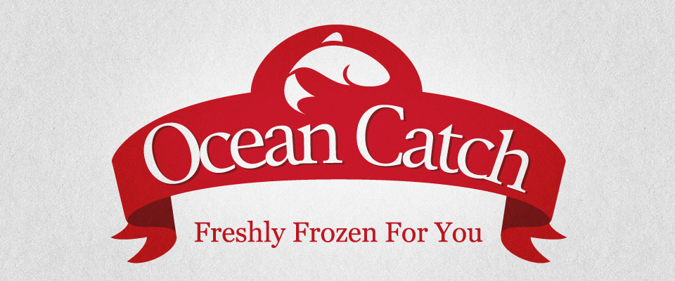
One of the first logos we created for a food brand. The Ocean Catch logo and brand and all of its marketing material and packaging was designed some years ago for Seatek UK, a company in the British Seafood Group of Companies. And whilst the British Seafood Group ceased trading in 2009 the Ocean Catch brand, due to its market success and penetration, was bought by a competitor and is still going strong today.
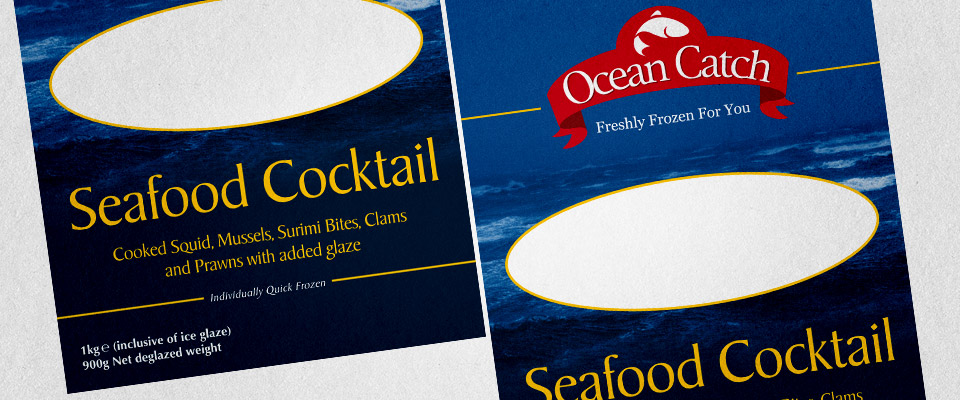
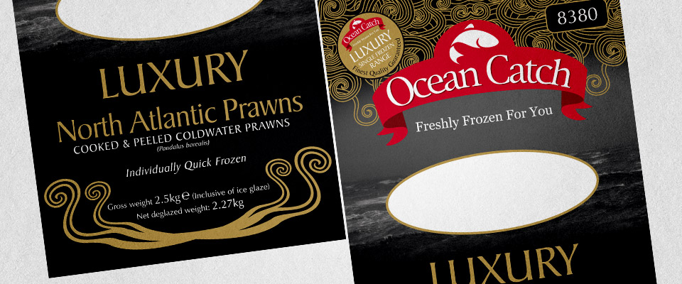
The brief was simple, create a strong brand for a new range of foodservice seafood products that would go toe-to-toe with the existing product ranges from other major companies. The design had to be simple, highly visible, highly legible and be designed to allow for application onto a wide variety of materials from low grade cardboard to food packaging film and all using various print technologies, some good, some not so good. All of this meant the the design had to be robust enough to achieve a consistent look even when the print quality was low whilst ensuring a quality brand feel.
The brief was simple, create a strong brand for a new range of foodservice seafood products that would go toe-to-toe with the existing product ranges from other major companies. The design had to be simple, highly visible, highly legible and be designed to allow for application onto a wide variety of materials from low grade cardboard to food packaging film and all using various print technologies, some good, some not so good. All of this meant the the design had to be robust enough to achieve a consistent look even when the print quality was low whilst ensuring a quality brand feel.
The final result was a logo and branding device that was extremely flexible, that looked good no matter what it was applied to, regardless of the print technology being used at the point of application and a brand that felt both authentic and established but also offered something a different to the other brands in the marketplace.
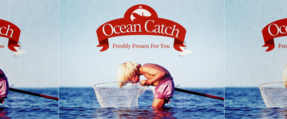
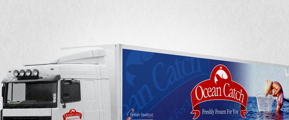
To accompany the identity we also invested in an image that would become synonymous with the Ocean Catch brand, the 'little boy'. The little boy imagery was used to give the brand a look and feel that gave it a timeless quality and helped place the brand and its products in a positive, natural, healthy and enjoyable frame without saying a word.
To accompany the identity we also invested in an image that would become synonymous with the Ocean Catch brand, the 'little boy'. The little boy imagery was used to give the brand a look and feel that gave it a timeless quality and helped place the brand and its products in a positive, natural, healthy and enjoyable frame without saying a word.