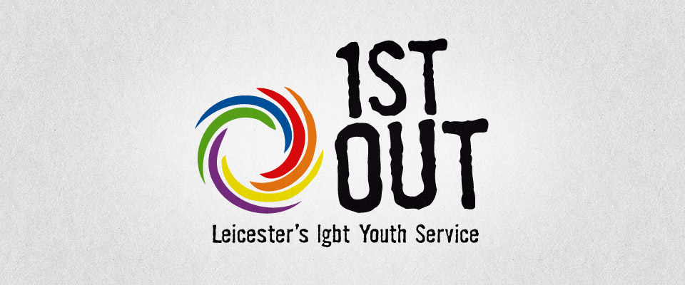
1st Out • Leicester’s LGBT Youth Service


Designing for young adults and teens can be one of the most difficult markets to work for. Not only are they equally as demanding as adults but they tend to be more sensitive to how things look, being more connected to aesthetic issues, fashions and fads. When Tim Peters from Leicester LGBT centre approached up to help them design a new identity for the youth section of the centre we knew that the most important people to impress were the young people themselves as this was going to be representing them as a whole.
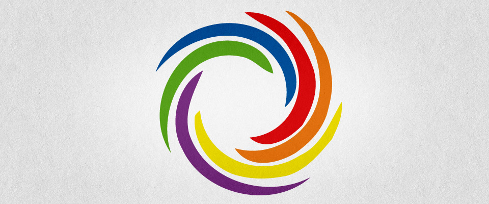
Consulting with Tim and the rest of the group highlighted specific things that they wanted the identity to achieve and also the name that they, as a group had decided upon. It had to have aspects of the typical 'rainbow' organisations but they also wanted it to feel a bit less formal but still remain a brand that looked like it had a serious job to do. Approachable but authoritative. The final execution did just that. A less formal choice of typeface combined with a swirling rainbow gave them exactly the look that they were looking for. Cool enough to like but serious enough to respect.
Consulting with Tim and the rest of the group highlighted specific things that they wanted the identity to achieve and also the name that they, as a group had decided upon. It had to have aspects of the typical 'rainbow' organisations but they also wanted it to feel a bit less formal but still remain a brand that looked like it had a serious job to do. Approachable but authoritative. The final execution did just that. A less formal choice of typeface combined with a swirling rainbow gave them exactly the look that they were looking for. Cool enough to like but serious enough to respect.
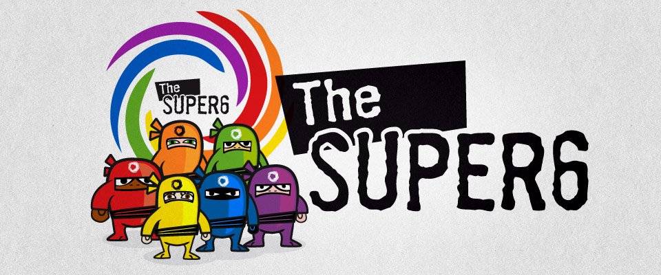
After completing the identity creation for the 1st Out group we were then approached by a youth worker for Leicester's LGBT centre to help them create a new look and feel to help educate younger adults and teens about LGBT issues and also give them imagery that would avoid the typical ones associated with the sector.
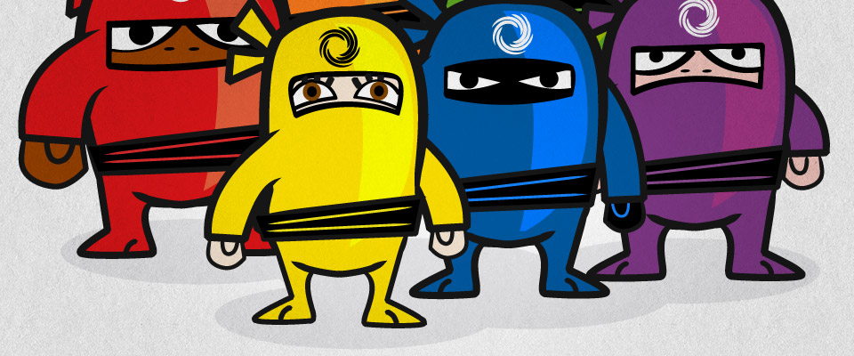
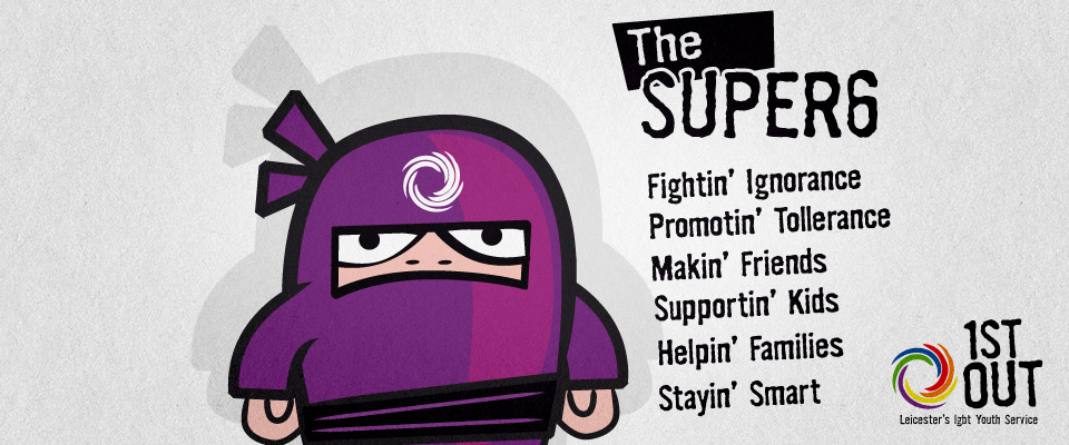
he theme that the young people settle on was a team of ninjas, highly trained in fighting ignorance and committed to helping people from different backgrounds find common ground and get on. The name they cam up with was the SUPER 6. Our job was to take this basic idea and breath life into it. We created both the brand which used the rainbow flag and also the SUPER 6 team ninjas. Each one representing a different type of person but refusing to fit a stereotype and keeping their identity secret. The brand colour scheme was brought into the ninjas' outfits making them both highly eye-catching and approachable but also conveying they they were representing the LGBT membership.
No weapons, just fighting ignorance with understanding and common sense.