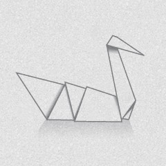
BlackLake


As a business cost saving consultancy, BlackLake wanted not only a new name but also a new identity that offered something more inventive and captivating that the usual bog standard, dry, business looking logo. They wanted something that could be used as both a metaphor for their business and also an icebreaker when meeting new clients. After looking at their business from top to bottom we put forward a shortlist of company names which we felt fitted them.
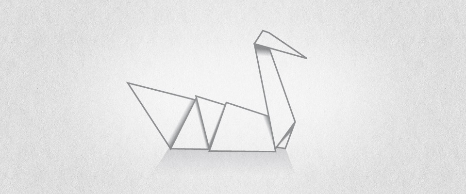
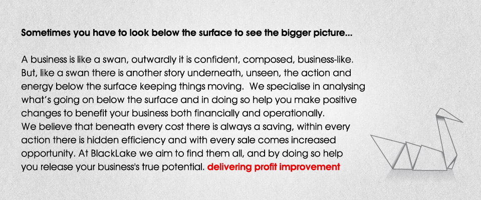
The favourite from a well received shortlist (it wasn't that short!) was BlackLake. From this point we began creating the identity inline with their brief. An identity that had a story and that could be used to break the ice. The final execution used an illustration of a paper origami swan as the mark in the logo which became the overriding branding theme for all of their materials and also played a central role in a story we built up around BlackLake and it's services.